One of the fundamental ways to make sure your social media posts are getting engagement is to include visuals. Images, infographics, and videos are more likely to capture a person’s attention when compared to text. If your post doesn’t include visual content, it risks getting lost in people’s timelines amidst all of the posts that do include visuals. To illustrate this point, let’s explore the facts (yay, statistics!)
- According to Buffer, Tweets with images are retweeted 150% more than Tweets without.
- 74% of social media marketers use visual assets in their social media marketing, ahead of blogs (68%) and videos (60%) (source).
- Eye tracking studies performed by Nielsen Norman Group suggested that when people find images relevant, they spend more time looking at them on a webpage than reading the text.
Bottom Line: Visuals. Use Them. Whether it’s a photo, an infographic, a video, or anything else!
But keep in mind, all visuals are not created equal, and there are things that make certain visuals more engaging than others. While these will differ depending on your industry (different audiences react differently to images), here are some general tips that are crucial when selecting visuals to include in your post:
Contents
1. Include Eyes
A tried and true method of getting people to stop at your image when scrolling through their newsfeeds is to include images where people appear to be staring at the viewer. Eye contact is a super engaging visual, and if your image draws eyes to your post, the viewer is more likely to stop, stare, and read your content.
This is a perfect example of an image where the entire visual appeal is based on eye contact.
2. Include a Lot of Colours, when Appropriate
We generally recommend sticking to a similar colour scheme (preferably your brand colours) when creating images – in order to make sure people are able to quickly connect the visuals to your brand. However, visuals that include a variety of colours are more eye-catching than those with few colours. So, whichever colour scheme you choose, at the very least, avoid images with only shades or dark colours.
Good:
Bad:
3. Design them for Easy Comprehension
Because the brain is able to quickly determine relationships between objects, people can create connections more quickly by looking at visuals than reading text. In the clever image below, Coke uses this idea to quickly teach people a new way of making iced tea – all without using a single word of text. Talk about taking advantage of the human brain!
4. Try Incorporating Humour
If you’re ever struggling to figure out how to connect with your audience, try using humour! Different types of people like different things, but a sense of humour is innate (we laugh even before we learn to talk).
Old Spice is a master at creating visuals that catch people’s eyes by using humour that’s immediately noticeable. This image is simple, creative, and effective!
5. Guide the Eyes with Lines
Using lines can help guide people’s eyes to sections of images that you want them to see. For example, try using lines to guide people’s eyes to an image labelled “call now” (or similar) – to direct their attention where you’d like it to be.
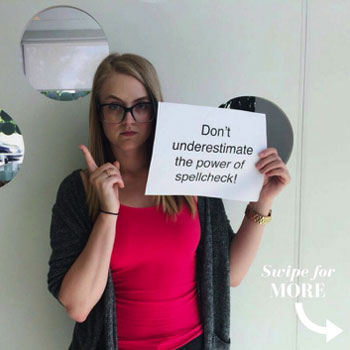
In the post below, we used arrows to encourage people to swipe left and see the next image in the post. This is perfect for Instagram, where you can include multiple photos in one post.
Treefrog Tip: When you are absolutely out of ideas for what visuals to include, or simply don’t have the resources to generate ones, use royalty-free image websites like Pixabay or PEXELS to search for images relevant to your post.
Keep in mind, you can’t always Google image search photos to include in your posts, as someone else may own the rights to them, and you may end up in trouble if you use them.
Need help creating eye-catching visuals that get noticed? Our graphic design and social media teams are made up of experts who understand the power of captivating imagery.
Request a free quote or give us a call at 905.836.4442 today!


